Friday, 27 November 2009

First design I idea - First attempt

Since Ive been designing a website for my swimming club, I thought I best actually start desigining. So I did. Heres my first design. I like it. Although, compared to others in my group its pretty rubbish. You have to remember Ive never done anything like this before though...

So here it is. Ill design probably 2/3/4 more. But I like this. Even though I know you arent just supposed to go with your first idea. I think it works nicely, is relevent and to the point clearly.

Since its just the first attempt, and just the home page, theres a few 'tweeks' that need to be made (Thanks to Sam Marsh for pointing those out!). Theyl be done very shortly, with more designs.

But if anyone actually reads this... please let me know what you think!

Friday, 20 November 2009

Colour Scheme Designer

After Tuesday's tutorial with Simon (which was very useful I might add) I came away with this. Its another colour wheel, but it doesnt only show you the colour and give you the code for it, it shows colours which contrast well to this colour. Its amAZing. Thanks Daryl K! Heres a little screen shot and the URL for those of you who want to pay it forward.

Colour Scheme Designer

Friday, 13 November 2009

Logo Change

Also during todays lecture/seminar, we've been given the task of changing a logo/brand to see what it would look like in a different colour. Does it look good compared to the original or not? Lets see...


Color Wheel

Before I start, sorry for the americanism.

So Whilst in todays Shaun lecture, we talked a lot about colour and what goes with what. We were given the task of finding a colour wheel, basically something that gives you the RGB, percents and HTML codes for colours. He made us find our own so we can get used to using something we liked arather than something that he just gave us.

Anways, I found this one. and its really cool. Not only does it give you the link to the colour wheel, bu the page gives you information about which colours go together, and what certain colours mean.

Very interesting!!

Picture from http://www.sessions.edu/ilu/ilu_1.asp. Accesswed on 13th Nov 2009

Thursday, 12 November 2009

My website idea

We've been given a project across the whole of the Exploring Multimedia modual to make a website based on a building, space or an environment. After due consideration I chose to do my swimming club. Ive been doing there since I was 3 and swimming since I was 14. Ive been teaching from then on and have been qualified for 4 years now. I love it. And Im now thinking of becoming a teacher, but thats another story.

So the first task we were given on this project was to design wire frames for the pages on what they were roughly going to look like. Never having made a website before, I thought this would be really difficult, but actually it was quite easy. However, thinking about the basic design got me thinking about colour schemes etc, and thats not what needs to be done right now.

The examples below are of the home page and staff profile pages. I chose the set the navigation at the top as its easy to find and I think would work well, but now Im thinking of changing it to the side so that drop-down menues can be created. Not sure yet though. These are just the initial designs and are NOT final. I'll have to see what people at swimming think.

Enjoy!


Friday, 30 October 2009

Grace Finally Has The Hang of Javascript!!!

YAY!

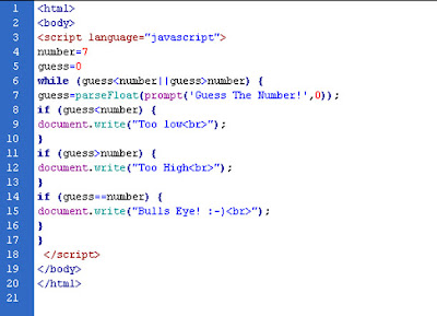
Here is what we did in todays seminar with David Downs.

(1) prints “Hello” to the screen 10 times by (a)
Sequence (b) Iteration

A


B


(2) asks the user to guess a number and tells the user if it is high, low or bulls eye :)


AND THEY ALL WORK!! :)

Thursday, 22 October 2009

The 3 Websites

The Pirate Bay

I love this website. Ill admit I use it all the time, but thats only because us English are so behind on American TV! Thsi is a file sharing website where users can search for all most anything they want and download it to their own computer. Its easy to get around because you just have to type what you want to search for and your away. I'll admit that its pretty hard to use at first because the downloadable files are named in a sort of code, but once you get the hang of it your all good. The one thing you have to be careful of when using this site is getting caught downloading. Because its wrong. But I do love this site.

AZ Lyrics

This is a muscial lyrics website where the users can look up song lyrics to all most any song. It has a search function which is good to use, but most of the time its easier to go through the names alphabetically. The content is easy to find but is not very easily laid out. Personally, I think there are too many adverts on the page, but thats where the money comes from. The users can add new lyrics or amend old ones that might be wrong. If it was me, I would use this website because its quicker to just type the lyric straight into google. But its good if you know the artist your searching for.

Facebook

Everybody loves Facebook, and allmost everybody knows what it is. This entirely user-content based website allows old friends to reconnect and new freinds to meet. The users make their own 'profile' by adding information and pictures about themselves. Sometimes people can add abit too much information, and you have to be careful not to add anything too personal. Facebook has undergone many changes throughout the years adding in more content for there users to play with and also changing the layouts. I would say that this is one of the biggest, most used websites online at the moment. Its certainly the one I use the most.

Wednesday, 21 October 2009

Joel Schafer: 'I'm into minimalistic clean design'

And that you are Joel. It took me a long time to read Saffer's interview and about 5 minutes to read Schafer's. He uses lots of short, one sentence answers, which are direct to the point (I like this). But its true what he says, he is "into minimalistic" design.

Personally, theres not much I can say on this interview. All the points he makes are relevent and correct, because the anwers are so short he explains it really clearly so Im not just thinking 'what?' . Plus, just like Saffer's he gives advice to the newer generation of designers, i.e me. So if you are an up and coming web designer, check him out. I'll deffinatly be doing that.

I think really, that is all I can say about this guy since he is so to the point, I think I have to be too. but, like the other, I'll post my favourite question, although I have two this time so it should be questions.

1)What advice would you give to beginning web designers?

- Check award sites for inspiration.

- Read as much design magazines as you can.

- Find some good boards that can help you if you get stuck with a project.

- And always make a manuscript before you starting to produce.

2)Do you remember the very first website you designed?

It was back in 1998 for a car parts company. It's still online and used, but I keep the address to myself.

Dan Saffer: 'Interaction design is an applied art'

Theodore Roethke noted, 'I learn by going where I have to go.'

This is a great article to read while just starting an Interactive Design course.

Dan Saffer talks about his everyday job, but breaks it down to simply everything he does whilst designing. And Ive decided he thinks like I think. for example, Saffer says that you can read all the bokos in the world, but it doesnt make you a good designer. I think that this is true, but if you read them and but what you have read into practice, especially when your learning, then you will keep getting better and better.

He gives you tips on what to do and what not do do whilst improving your skills. I found this part of the interview thoroughly helpfull.
What are the typical mistakes that interface design newbies encounter and how to avoid them?

I'd say there are two mistakes that new designers make: one is not coming up with enough variations—or, more accurately, not being able to come up with more alternatives.
The second mistake is one of details and completeness. What separates a great designer from a good one is the ability to not only come up with great concepts but to also see those through down to small details.

Starting out in this field, I found this interview really helpful seeing how a man already well established within design thinks. Im going to take on board what Ive learnt and put it into practice practice practice.

Id like to leave you with my favourite part of the interview:

The principle you follow in life and work?
I have three:

'The Way you know is not The Way.' –Tao Te Ching

'A body in motion tends to stay in motion.' Newton's First Law

'If it was easy, then everyone would do it.'

Monday, 19 October 2009

News Letters glore!

I thought also that I would post my recent work which more design than anything. Just email based marketing in the form of news letters for my Mums business. Ive found a new way of doing them, I use an online programme made by AMDCommunications (hello work experience!). Its pretty cool. Unfortunatly it wont let me post the newsletters anywhere, but believe me they look cool.

Anyone who wants to see them, I can forwad you an email copy - let me know!

Have fun!

Welcome Back! Its been a long time....

So I havent posted on here since I finished last year, and now Ive started year 2 (its craaaaazy I tell you).

Le me fill you in on a few things that have been happening...

1) I went to Eygpt diving over the summer, it was AMazing.
2) Ive chosen a pathway for year 2.
3) This is my last day of being 19.

Yes thats right, its my birthday tomorrow and Im 20. AS Sam says Im getting old and going grey. Help!

Anyways.................................

We have to pick a pathway for year 2 and since I want to do web design I was going to choose that pathway untill the course people changed it (grr) so I was seriously confused and didnt know what to do. I went to the Moving Image pathway aswell as the Interactive (web) one. Turns out theres a SHED load of coursework for Moving Image - like 8 pieces! thats toooooo much. And that choice kinda scared me. So I went to Interactive and it turns out its not changed that much, its still web design, its just moved with the times. So I chose INTERACIVE. And its pretty good. Although I have 9 hours on Friday (what?!)

So Im on the web pathway to success, lets hope it works.

Happy Birthday to me for tomorrow!


P.S to whoever reads this - check out a song called We Used to be Friends by the Dandy Warhols cuz your gonna love it.

Sunday, 17 May 2009

Flash Object


What would Grace Do? by ~gracie-loo on deviantART

AV Identities.

Yes, yes I know its late. But its on here now.

Wednesday, 6 May 2009

Logo...

Ok well thast not actually my finished logo. I dont know why but it wont show the image right. Its not blue, its yellow.

But check it out here:
http://www.facebook.com/photo.php?pid=30413578&l=b82c29df3e&id=1081743970

VW Camper Van

After playing around with Illustrator and Photoshop yesterday, this is what I came up with. Just playing really.

Logo - Finished!

After aaaaaages of waiting, here is my finished logo. Its a different approach to what I was doing before, but I think it works well.

Friday, 17 April 2009

Logo!

Hey, hows it going?

Been fairly busy over the East period, since you can see with my lack of posts! (Doesnt mean I havent been doing anything though does it!) I have my final 3 ideas for my logo.

Take a look, tell me what you think!

Have fun.


Sunday, 22 March 2009

Web Interactictivity 2 - NIKEiD

Following on from the previous post, I decided to look at the new NikeID website for Online Interactivity.

Its a very "cool" looking website which as you open it plays a video of Coach K and the Duke Blue Devils mascot (The Duke Blue Devils are the University of Duke's basketball team). It has a black background with bright colours applied over the top to stand out.

The site is very easy to use and is incredably fun too. The aim of the site is to let the user create their own unique shoes. These can then be bought and other people can view your designs and buy your shoes themselves.
Most of the content oif the site is relevent - although I dont understand what The video of Coach K has to do with it.

The design of the site reflects Nike the brand in that all Nike's internet sites have the same design - they are all 'sleek' and 'cool' - like the brand.

The interactive design elements in this site are extremely successful. They do what is required of them to a high standard. I would expect nothing less of Nike.
Im goinmg to add aswell that they stole Apple's little 'i' from 'iPod'

This website is awesome fun, its a shame the shoes are so expensive!

This is the shoe that like. I didnt make it but its just amazing. They even have my name on the back - how cool!

Web Interactivity.

As part of the Identities project I have to do I was told to analyse some online sites. I have been putting this off for a while now, and thought I best get on with it as Ive got a presentation to do tomorrow!

The first website that I'm going to look at is a spanish one (http://www.essaeubanco.com.br/v2/index.html?language=en-us). I hose this website as its kind of doing the same this as I'm doing for one of my Identity objects. The interactivity on this is HUGE. The user has to pick a character (either the girl or boy), and then has to answer quiestions that are going to bring the girl and boy closer together.
Video fottage is played of the girl and boy going about their day and they occasionally run into eachother. The user is asked a question , for example; how many pairs of shoes do you buy a month, and then the website says if you buy for example, one less pair of shoes a month then in 12 months you could go on holiday abroad. (Just and example.

It does this all through out the video and in the end if the user choses to take the websites advice it encourages them to save money. It is an incredably easy site to use - just click and go! However it can take a while to load depending on the speed of your internet.

The colours are bright against the black background which stand out nicely. Its aimed at the teenage to young adult age range so the colours fit nicely within that. The fact that it has music playing in the background will also keep the user interested. Also, the whyole theme of the website is designed to fit in with the age range it is intended for.

The aim of this website is to get the user to save money, it is not offering a product or service. Its an educational tool.

However much I have tried I cannot find the website of the company this mini-site I cant say how it reflects the philosophy of the conpanies brand or how the desgin reflects the identity of the company.

I chose to talk about this website because it ties with my AV object.

Take a look for yourself.


Wednesday, 18 March 2009

Identities - Avatar


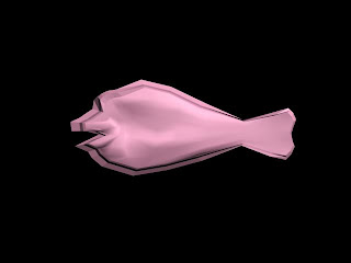
My Avatar is coming along nicely. As I said in my earlier post its a cartoon fish listening to an ipod with headphones (I hope). Well I figured out whilst dsoing this project that I HATE 3D Studio Max. But its gotta be done. Heres some photios of how its getting on. And what the fish is gonna look like when its finished.

Identities - yay!

My identities project is coming along nicely... even if Ive not showed it on here, which is my aim from today. Four out of the 5 projects have been started... let me brief you.
Avatar - Fish listening to an iPod (How cool!)
Logo - My name in bubbles I think or some sort of shape - got some steches to choose from before I create my final one.
AV - A pixilation about my day at a dive centre which may include diving. Deffinatly putting my kit together and everything and getting it in the water.
Object 4 - Flash interactive of a day in the life of me. The user will have to make all my decisions of what I wanna do for the day. A typical Grace day.
Object 5 I have no clue about yet.

Just to let you know how things are getting on!

Thursday, 26 February 2009

Friday's Identities Work - Who Am I?

We've been having a lecture on Friday for the past two weeks taken by an artist trying to get us think about our identity's and what this means. Like we're not doing this already?

Heres the task we were set...
• Create your own portrait using the object collection you have selected. (you do not need to put yourself in this image)
• Explore composition and location.
• Find a real location or construct a location using ideas from last weeks mapping tasks or your mood board work.
• Experiment with how you photograph your objects in this environment considering scale, light and framing.
• Consider the narratives these objects seem to write, look at the affect of combining objects. You may exclude one object that you feel doesn't fit the portrait you want to create.
• Experiment with more formal and apparently chaotic compositions.
• Explore how much the narratives can change through different compositions of the object, as they are placed both individually and together.

Ive taken three photos - all different compositions and Ive readjusted them on photoshop everso slightly. Not sure which one I like the best... most likley I'll tell you soon.
Take a look - let me know what you think.


Wednesday, 25 February 2009

Deb Tucks Identities Task

This week in identities we were talking about corporate identities and how they change through time.
We were also given the task of making ourselfs into a 3D shape thats reflects us in some way. I've chosen to be a cube because I think Ive got lots of interesting sides to me. I'm not onesided. Also because the points reflect the different 'points' of my personality - let me explain. One point is courage, one is my reliableness etc.
The colours also represent me (they arent just there to look pretty... although it helps). The cube is multicoloured because it shows that I'm mixed up. It also represents a point in my life right now - how I dont know which pathway to take on this course.

If you had to be a 3D shape.... what would you be? Think about it, it's harder than you think.

Tuesday, 24 February 2009

Seminar Work.

Listening to Gavin DeGraw - who is an awesome person :).

Thought I best do some work too... (see below).

Before starting this course, I only really did creative stuff for my work and my Mum's business, so I guess it was all done for them. Occasionally I did a bit for myself but more art than computer based. Now though, I find myself doing it more for me and enjoying it. I think I did it in this way because I've always been too lazy just to sit down and do something for me, but now, Im learning all these interesting techniques and wanting to try them out more myself. The college/school work was done, obviously, because I had to do it to pass the course. The work for my Mums business was done cuz she asked me to, I couldnt really say 'no' could I?

At this point in time I want the future of MY creativity to be for three purposes. 1 - my work cuz I want to go into graphics (maybe). 2 - for me. Cuz whats the point in not doing something for myself, and hopefully I'll learn some really cool techniques which I can use over again. 3 - for my Mum cuz she won't pay anyone else to do it when I can do it for free. I want my future creativity to be everything from doodling on a piece of paper, to making the most awesome print based stuff.

By doing research, I have been able to see what other people in that field are doing and take ideas from their work. Also, I have been able to carry on on-going projects, this from of research is interim. But I'd say I probably use exploritory research the most.

The research type that I don't like to use (or feel wary of) is pilot because I dont like doing things on a small scale. If I reserach something then I'll go all out for it.
The way I start research is that I look behind that research into the social, political and cultural context (among other things). The way I feel it ios best to start research is to look In or through that research seeing how the work came together and the processes behind that work.

]there you have it... an insight into how I work - how fasinating.

Thursday, 22 January 2009

3D Animation


Today, I had the first Identities seminar in which we had our first attempt at using 3D studio Max - some animation software.
It looked totally complicated as Andy was explaining what to do, but I think you've just got to experiment and if something works then its awesome, but if it doesnt you just undo it.

Anyways... above is my first attempt at using this. See what you think.

Thursday, 15 January 2009

Mr-AZ

Last post of the evening. you can all sigh with relief.

Since about September, Ive been listening to music by Jason Mraz, hes an awesome guy. I love his music and thought I'd share part of a song with you that Ive been listening to alot recently.
It might give you another way of thinking.

"Song For A Friend" - Jason Mraz.

Climb up over the top.
Survey the state of the soul.
You've got to find out for yourself whether or not you're truly trying.
Why not give it a shot?
Shake it. Take control and inevitably wind up
Find out for yourself all the strengths you have inside of you.

Its from the Album Mr A-Z, take a listen - its amazing.

Taba Heights Photos.


Some of my favourite photos I took in Egypt. The last one didnt take... I'm on the bottom right corner sitting down.

News Just In!

Whilst writing my last post... Which came about 3 minutes ago.

ap409 - a Deviant Art member added the Scuba Diving Adventure onto his favourites list! Pretty cool huh?

Just thought I'd let you know.

Creative Narrative -> Piece 3


Scuba Diving Adventure by ~gracie-loo on deviantART

This is the first official piece of university work that I have fully done on my own. I think its my best piece of work so far... althougth the One Shot Film is a close second.

This piece was made using photos I took on last years diving holiday to Taba Heights, Egypt... went with a few of my dive buddies (no pun intended). That holiday was probably one of the best holidays ever.

The idea behind this is that I wanted something that everyone could find fun. Not just if you belong to that clik... for example... a few people based theirs on skateboarding, some on nights out etc. Everyone can find this fun.
You plan your dive, thats simple as. You pick your dive buddy, and learn about some of the fish that live under the Red Sea. Its educational as well exciting!

Have a play and see what you think.

One Shot Film -> Piece 2


One Shot Short film. We got given the brief that it was to be 2 minutes long, the camera had to stay on the tri-pod at all times and we were only allowed one camera movement. How hard is that?!
We went with a That 70's show esc. conept... you know at the end where theyre smoking weed in the basement and the camera goes in a cirle and switches from one character to another...?
I think it worked pretty well... shame the footage wasnt abit better with the brightness. I think it looks pretty good though.

Take a look.

Pixelation -> Piece 1


Pixelation is like stop-motion animation with people. Its pretty cool stuff. What happens is... you basically take photo after photo of people who move a little each time and string them all together to make a sequence of video. Its very fun to do so would recommend it for a rainy day (or not so rainy cuz it kind of requires the outdoors. The photos were edited in post production but I only fiddled around with the brightness and contrast.
Chose the Mark Ronson song God Put A Smile Upon Your Face Feat. Daptone Horns. Thought it fit in nicey with the footage. Didnt actually mean for the images to cut on beat at the start but its cool that they did.

Enjoy!

The first in a string

So I really should get in to doing this more... Its not not like I dont have the time. With the 8 hours or so of university... whats with that anyways?

By the way... HAPPY NEW YEAR! Bit late but who cares?

So decided I'm gonna post up all the work that Ive been doing since I started this course, which I should have already done. Some of my own stuff too.

Here goes...