Friday, 5 February 2010

Design Ex. 12 - Cameron Moll

We've been given the task in today’s lecture/seminar with Shaun to analyse a web 2.0 website. I got given a guy called Cameron Moll and it turned out to be his portfolio.
All websites used can be found linked at the bottom.

Moll is a graphic turned web designer; he also is an author and speaker.

When it comes to web designing, Moll likes to stick to a particular style and keeps most of his sites relatively similar with the navigation running long the top, information centred to the screen and the use of a subtle over all background colour and then a darker shade of the same colour in the body of his site. These all work very well.

However, occasionally he does tend to make something a little different. Take the Css Mastery Case Study site; even though it’s a fictitious site, it goes against everything he normally does. For example, the navigation is in the form of a contents page in a book, and main body of text is split into two neat columns.

Getting back to his portfolio site. I like the use of colours and textures. These are subtle changes which are most effective. On top of that, the images which he uses to show his work are good because the bold colours contrast well with the red background. What I find a bit strange is the fact that there is no navigation, rather links to other sites like his blog, or a google search. I also like how everything is laid out in the same way. For example, the relative texts ate all inline with one another, this makes it look very neat.

Looking at his sites, they all seem relatively the same, apart from the one I have mentioned. When I develop my discipline, I would like to develop a style but I would like to more make things that are different from one another so I don’t get stuck in a rut making the same style of website over and over again. Variation is key.

The things I would take from his work and use myself are the use of colours and the subtle changes he makes to them. A good example of this is the March of Dimes website (see below). Cameron uses a pale shade of purple as the overall background colour and then uses a darker shade for logo and navigation.

Another thing I would use is his use of textures. They tie in with the theme of the website very well and again are sometimes only subtle.

Overall I think he is very talented but I would like his online portfolio to maybe have more pages.

Websites used:
http://cameronmoll.com/portfolio/
http://tuscany.cssmastery.com/#
http://marchofdimes.com/

Other examples of work:
http://cameronmoll.com/projects/lds/home1b.html
http://www.hiram.edu/index.html
http://www.english360.com/
http://www.cameronmoll.com/projects/bmb/
http://www.joyent.com/
http://www.vivabit.com/

Thursday, 4 February 2010

kuler (adobe)

After just watching a fairly boring video on Flash publishing (http://tv.adobe.com/watch/flash-in-a-flash/episode-6/), I found this. Well... the guy int he video showed it me.

Its Adobe's version on the colour wheel. It lets you search its database for colour schemes to do with anything. I typed in 'ice cream' and it gave me colours associated with ice cream. I then typed in 'Ben and Jerry's' and it gaveme colours associated with that! Amazing. You can also create your own.

Check it out.

kuler (click the word) or the link is here http://kuler.adobe.com/#

Wednesday, 20 January 2010

New Year, New Project.

Uni started again last week and we were set a project straight away (sad face). the brief was to find a retail outlet (this can be anything from a bar to a little shop to a hair dressers), and make a website for your chosen business in two weeks. Apparently, its do-able. We'll see though.

Anyway, I chose the beauty salon Euphoria in Beeston, where I live. It just happens to be owned by my Mum. I chose this mainly because the website that euphoria (its supposed to have a small "e") has at the moment is rubbish. It would also be easy for my to go in and take photos and information.

So I have made 3 design ideas and Im still waiting for a forth to come. But heres the first 3. Let me know what you think and whats good/bad about them. Preferably tell me which one you think I should use.

Thanks :)


Thursday, 14 January 2010

Designers

Wikipedia (yes I know its wrong to use... but its just too good) defines a designer as "a person who designs or creates something." That's kind of a given really. (http://en.wikipedia.org/wiki/Designer accessed on 14/1/10).

Anyway, we were given the task of finding three Non web designers and we have to write about them as a designer, why we like them/their work and how their work can relate to my web design work. The three designers I have chosen are sort of the same - not very diverse... But the brief didn't specify how diverse they had to be.

Designer 1: Clothes Designer: Paul Smith

I have chosen to do Paul Smith as one of my designers simply because I love his work. I admit to owning a number of his clothes and accessories.

He's been designing for 40 years and started out in Nottingham (where I live) with a tiny shop on Byard Lane in 1070. Now he has shops in places all over the world like New York, London, Tokyo, Dubai and Los Angeles to name a few.

The main reason why I like his work so much is, that he's not afraid to break the barriers. For example, when some of the high street clothes shops made t-shirts with shirt designs printed on them (so it was a t-shirt that looked like a shirt), Paul Smith went one step further with one of his women's collections by printing pictures of cardigans and scarves on to tshirts so make it look like you were wearing just that. See the photo below if you didn't understand a word of that. That's what I hope to do with web design when I'm good enough at it. Then, hopefully, I can get my work out their and do stuff other people haven't. Another reason why I like him is that he uses lots of colours that go together really well (which kind of helps when your designing clothes). This is a good skill for web designers to have to help make your websites eye catching. A good example of how Paul Smith does this is with his Signature Stripes. (see picture below).


Designer 2: Interior Designer: Adrienne Chinn

My second designer is an interior designer. Mainly because I think rooms are like websites, everything has its own special place. The designer I have chosen is Adrienne Chinn.

Chinn owns her own interior designers, Adrienne Chinn Design Company Limited and had an "intention of bringing high quality original interior design to the residential and commercial marketplaces." (http://www.adriennechinn.co.uk/the.htm accessed 14/1/10)The business has been going since 1999.

I love Adriennes work because she can make a room into any style the client wants. This is a good skill to have for a web designer. To be diverse can mean getting a really good job rather than just an OK one. She also know what things work well together.

Whilst designing websites at the moment, I like to go for the simple effect, mainly because that's all I know how to do at the moment.Chinn also goes for this approach regularly, but knows how to make the "simple" look good. I hope I do this too.
See the example below of a kitchen she designed. Simple, yet elegant.


Designer 3: Graphic Designer: David Carson

For my final designer I chose David Carson, a graphic designer, supposedly one of the worlds most influential graphic designers. He worked for a LOT of big name/brand companies during his long career (1983-present) including Microsoft, Nike, MGM Studios, Quiksilver and American Airlines. (Check out http://en.wikipedia.org/wiki/David_Carson_%28graphic_designer%29 for a list of nearly all of them).

When looking at his work I found his bold use of colour amazing. (See my example below). As for the same reason as Paul Smith - what he does works.

The main thing I like about him is his extensive use of typography and the way he experimented with it. No graphic designer would have the its to do what Carson did if Carson hadnt done it firs, its too much of a 'risky' move.

A final thing that I would use from Carsons work is the ability to do what you want without any boundaries. Sure, if you have a client, then you have to do what they want. But if your designing something then go all out.


I realise I have gone faaaar over the word limit. But ohwell! I stick to them normally :).

Tuesday, 12 January 2010

Software Development Models: Waterfall and Whirlpool

The Waterfall Model is given its name by the way the phases run downwards (like a waterfall). It comprises of five phases and the next phase cannot be started until the last one is totally finished. This means that if a problem arises later on in production from an earlier phase, it cannot be corrected without it affecting the rest of the production. The first phase of this model is Requirements. This is like the brief at the beginning of the project, it tells the designer what to do. Phase two is Design. The third phase is Implementation. This is basically the phase of construction or coding. Phase four is Verification – testing to make sure it works. The final phase is Maintenance which is simply the upkeep of the software. See the image of this model below.


The Whirlpool Model combines the Waterfall Model with the Prototyping Model. However, this model only has four phases. During the first phase, system requirements are given and risk assessments are carried out. The second phase is probably the most import is this model. Here, all possible alternative strategies are analyzed. If the risk assessment from the phase before flag up any uncertainties then this phase is used for preliminary prototyping with the data already collected to find out a possible solution to the problem. The third phase a prototype of the software which has some of the characteristics of the final design, like a scaled down model. The final phase is a second prototype being made by analysing the first one in terms of strengths and weaknesses. The second prototype is then tested, and the final phase is repeated. The best thing about this model is that it allows the designer to deal with more than one phase at once unlike the Waterfall Model. At the end of each phase, a review is completed. See the image of this model below.


The Use of the Whirlpool Model in Web Design
The Whirlpool Model is a far better model to use than the Waterfall Model when making website for a number of reasons. The first one being, that the internet is changing all the time by means of new coding and applications. So by using this method, the developer can keep going back to the website and changing it to keep it up to date.

Another reason is that each phase doesn’t have to be completed before moving onto the next one. This would be fairly hard to do as the developer is constantly changing the code when making the website when something goes wrong.

A third reason of choosing the Whirlpool Method over the Waterfall would be that in this method, testing is done constantly, and this is needed for web design.

Friday, 27 November 2009

First design I idea - First attempt

Since Ive been designing a website for my swimming club, I thought I best actually start desigining. So I did. Heres my first design. I like it. Although, compared to others in my group its pretty rubbish. You have to remember Ive never done anything like this before though...

So here it is. Ill design probably 2/3/4 more. But I like this. Even though I know you arent just supposed to go with your first idea. I think it works nicely, is relevent and to the point clearly.

Since its just the first attempt, and just the home page, theres a few 'tweeks' that need to be made (Thanks to Sam Marsh for pointing those out!). Theyl be done very shortly, with more designs.

But if anyone actually reads this... please let me know what you think!

Friday, 20 November 2009

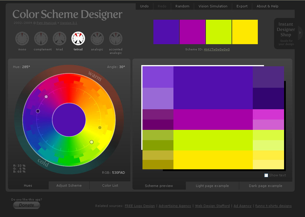
Colour Scheme Designer

After Tuesday's tutorial with Simon (which was very useful I might add) I came away with this. Its another colour wheel, but it doesnt only show you the colour and give you the code for it, it shows colours which contrast well to this colour. Its amAZing. Thanks Daryl K! Heres a little screen shot and the URL for those of you who want to pay it forward.

Colour Scheme Designer

Friday, 13 November 2009

Logo Change

Also during todays lecture/seminar, we've been given the task of changing a logo/brand to see what it would look like in a different colour. Does it look good compared to the original or not? Lets see...


Color Wheel

Before I start, sorry for the americanism.

So Whilst in todays Shaun lecture, we talked a lot about colour and what goes with what. We were given the task of finding a colour wheel, basically something that gives you the RGB, percents and HTML codes for colours. He made us find our own so we can get used to using something we liked arather than something that he just gave us.

Anways, I found this one. and its really cool. Not only does it give you the link to the colour wheel, bu the page gives you information about which colours go together, and what certain colours mean.

Very interesting!!

Picture from http://www.sessions.edu/ilu/ilu_1.asp. Accesswed on 13th Nov 2009

Thursday, 12 November 2009

My website idea

We've been given a project across the whole of the Exploring Multimedia modual to make a website based on a building, space or an environment. After due consideration I chose to do my swimming club. Ive been doing there since I was 3 and swimming since I was 14. Ive been teaching from then on and have been qualified for 4 years now. I love it. And Im now thinking of becoming a teacher, but thats another story.

So the first task we were given on this project was to design wire frames for the pages on what they were roughly going to look like. Never having made a website before, I thought this would be really difficult, but actually it was quite easy. However, thinking about the basic design got me thinking about colour schemes etc, and thats not what needs to be done right now.

The examples below are of the home page and staff profile pages. I chose the set the navigation at the top as its easy to find and I think would work well, but now Im thinking of changing it to the side so that drop-down menues can be created. Not sure yet though. These are just the initial designs and are NOT final. I'll have to see what people at swimming think.

Enjoy!


Friday, 30 October 2009

Grace Finally Has The Hang of Javascript!!!

YAY!

Here is what we did in todays seminar with David Downs.

(1) prints “Hello” to the screen 10 times by (a)
Sequence (b) Iteration

A


B


(2) asks the user to guess a number and tells the user if it is high, low or bulls eye :)


AND THEY ALL WORK!! :)

Thursday, 22 October 2009

The 3 Websites

The Pirate Bay

I love this website. Ill admit I use it all the time, but thats only because us English are so behind on American TV! Thsi is a file sharing website where users can search for all most anything they want and download it to their own computer. Its easy to get around because you just have to type what you want to search for and your away. I'll admit that its pretty hard to use at first because the downloadable files are named in a sort of code, but once you get the hang of it your all good. The one thing you have to be careful of when using this site is getting caught downloading. Because its wrong. But I do love this site.

AZ Lyrics

This is a muscial lyrics website where the users can look up song lyrics to all most any song. It has a search function which is good to use, but most of the time its easier to go through the names alphabetically. The content is easy to find but is not very easily laid out. Personally, I think there are too many adverts on the page, but thats where the money comes from. The users can add new lyrics or amend old ones that might be wrong. If it was me, I would use this website because its quicker to just type the lyric straight into google. But its good if you know the artist your searching for.

Facebook

Everybody loves Facebook, and allmost everybody knows what it is. This entirely user-content based website allows old friends to reconnect and new freinds to meet. The users make their own 'profile' by adding information and pictures about themselves. Sometimes people can add abit too much information, and you have to be careful not to add anything too personal. Facebook has undergone many changes throughout the years adding in more content for there users to play with and also changing the layouts. I would say that this is one of the biggest, most used websites online at the moment. Its certainly the one I use the most.

Wednesday, 21 October 2009

Joel Schafer: 'I'm into minimalistic clean design'

And that you are Joel. It took me a long time to read Saffer's interview and about 5 minutes to read Schafer's. He uses lots of short, one sentence answers, which are direct to the point (I like this). But its true what he says, he is "into minimalistic" design.

Personally, theres not much I can say on this interview. All the points he makes are relevent and correct, because the anwers are so short he explains it really clearly so Im not just thinking 'what?' . Plus, just like Saffer's he gives advice to the newer generation of designers, i.e me. So if you are an up and coming web designer, check him out. I'll deffinatly be doing that.

I think really, that is all I can say about this guy since he is so to the point, I think I have to be too. but, like the other, I'll post my favourite question, although I have two this time so it should be questions.

1)What advice would you give to beginning web designers?

- Check award sites for inspiration.

- Read as much design magazines as you can.

- Find some good boards that can help you if you get stuck with a project.

- And always make a manuscript before you starting to produce.

2)Do you remember the very first website you designed?

It was back in 1998 for a car parts company. It's still online and used, but I keep the address to myself.

Dan Saffer: 'Interaction design is an applied art'

Theodore Roethke noted, 'I learn by going where I have to go.'

This is a great article to read while just starting an Interactive Design course.

Dan Saffer talks about his everyday job, but breaks it down to simply everything he does whilst designing. And Ive decided he thinks like I think. for example, Saffer says that you can read all the bokos in the world, but it doesnt make you a good designer. I think that this is true, but if you read them and but what you have read into practice, especially when your learning, then you will keep getting better and better.

He gives you tips on what to do and what not do do whilst improving your skills. I found this part of the interview thoroughly helpfull.
What are the typical mistakes that interface design newbies encounter and how to avoid them?

I'd say there are two mistakes that new designers make: one is not coming up with enough variations—or, more accurately, not being able to come up with more alternatives.
The second mistake is one of details and completeness. What separates a great designer from a good one is the ability to not only come up with great concepts but to also see those through down to small details.

Starting out in this field, I found this interview really helpful seeing how a man already well established within design thinks. Im going to take on board what Ive learnt and put it into practice practice practice.

Id like to leave you with my favourite part of the interview:

The principle you follow in life and work?
I have three:

'The Way you know is not The Way.' –Tao Te Ching

'A body in motion tends to stay in motion.' Newton's First Law

'If it was easy, then everyone would do it.'

Monday, 19 October 2009

News Letters glore!

I thought also that I would post my recent work which more design than anything. Just email based marketing in the form of news letters for my Mums business. Ive found a new way of doing them, I use an online programme made by AMDCommunications (hello work experience!). Its pretty cool. Unfortunatly it wont let me post the newsletters anywhere, but believe me they look cool.

Anyone who wants to see them, I can forwad you an email copy - let me know!

Have fun!

Welcome Back! Its been a long time....

So I havent posted on here since I finished last year, and now Ive started year 2 (its craaaaazy I tell you).

Le me fill you in on a few things that have been happening...

1) I went to Eygpt diving over the summer, it was AMazing.
2) Ive chosen a pathway for year 2.
3) This is my last day of being 19.

Yes thats right, its my birthday tomorrow and Im 20. AS Sam says Im getting old and going grey. Help!

Anyways.................................

We have to pick a pathway for year 2 and since I want to do web design I was going to choose that pathway untill the course people changed it (grr) so I was seriously confused and didnt know what to do. I went to the Moving Image pathway aswell as the Interactive (web) one. Turns out theres a SHED load of coursework for Moving Image - like 8 pieces! thats toooooo much. And that choice kinda scared me. So I went to Interactive and it turns out its not changed that much, its still web design, its just moved with the times. So I chose INTERACIVE. And its pretty good. Although I have 9 hours on Friday (what?!)

So Im on the web pathway to success, lets hope it works.

Happy Birthday to me for tomorrow!


P.S to whoever reads this - check out a song called We Used to be Friends by the Dandy Warhols cuz your gonna love it.

Sunday, 17 May 2009

Flash Object


What would Grace Do? by ~gracie-loo on deviantART

AV Identities.

Yes, yes I know its late. But its on here now.

Wednesday, 6 May 2009

Logo...

Ok well thast not actually my finished logo. I dont know why but it wont show the image right. Its not blue, its yellow.

But check it out here:
http://www.facebook.com/photo.php?pid=30413578&l=b82c29df3e&id=1081743970

VW Camper Van

After playing around with Illustrator and Photoshop yesterday, this is what I came up with. Just playing really.